WHAT IS A DIGI-PAK?
A digipak is basically a CD case with the contents being the music disk, perhaps a booklet with a list of songs, lyrics, companies involved etc, and even sometimes an autograph. Digipaks are typically made from card or plastic in which on the front the artist will most likely appear there and the back also a possible list of songs. Digipaks were first created by Mead Westvaco, and their product, called Digi-Pak, is trademarked. However, as the format became more popular and began to be used by more manufacturers.Now in current times digipaks are very common and very popular.
They are a form of promotion, they promote the disc inside and the artist to the audiences.
How does a digipak benefit the artist?
The front of the digipak with have some aspect of what the artist represents and what their predominate genre is. The digipak will most likely embody and theme and a message about the artist image. This links to emphasising the artist brand image which increases the popularity of the artist. The digipak also exemplifies the artistic and creative approach the artist is taking throughout the music. For example if there’s some futuristic idealism conveyed in the lyrics or the visuals in the music video then the front cover wouldn’t be very contemporary but more obscure and abstract. All aspects of the digipak, brand image and music video are all interwoven together. Digipaks benefit the artist and their music as its promotional aspect of the music industry which helps bring awareness to the artist thus selling the artist and encouraging consumers to buy and listen to their music.You could argue that buying a digipak establishes your loyalty to your artist
Dimensions
-
Standard Size "CD style" Digipaks:
-
1-Disc Digipak (4 or 6-panel): 5.45"W x 4.95"H x 0.25"D
-
2-Disc Digipak (4 or 6-panel): 5.5"W x 4.95"H x 0.44"D
-
-
DVDigipak: 5.45"W x 7.4"H x 0.44"D


In terms of ingredients to building a Digipak it would contain one of the following:
-
Visual image/Key to the production
-
Band/Artist name – allow the audience to identify the artist
-
Album title – on main cover and along the spine
-
Track list/What’s on the DVD
-
(Occasion reviews from companies)
-
Lyrics
-
Links to the artist
-
Acknowledgement

DIGIPAK ANALYSIS
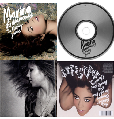
This digipak is from the indie pop artist Marina and the Diamonds. Fitting with normal conventions, this digipak does contain images of the artist. One of the images on the digipak looks gritty, vintage and is black and white, which ties in with the indie aspect of indie pop, and the other two appear airbrushed and glossy which ties in with the pop aspect of indie pop. The colour scheme on the digipak is toned down and features black and white, adding the the vintage asthetic of the digipak, which helps to connote the genre of the artist to the audience. The tracklist and the artist/digipak name are all printed in the artist's recognisable typography, and the colour (white) of the typography is consistent throughout apart from the disk (black) to keep a consistent theme for the digipak.


Ellie Goulding is an artist who focuses on the alternative, indie pop, and dance genres of the music industry.
The colouring of her cover is purples and pinks. The top of the cover starts off as a dark purple and fades into a bright pink, reminding the audience of lighting in a club. Her hair is also a bit all over the place, as though she has been dancing and jumping around, this hints to the audience that she does focus on the dance genre as well.
Her facial expression appears to be calm, but also sort of sad, and you can tell that this is probably effective in how she wants the audience to feel when listening to her song. Calming, but also emotional. The colours also help with this, as these colours and be seen as emotional colours but also have a calming and relaxed feel to them. The way the colours fade into each other, with blue at the top, comes across as the night time. This coincides with her facial expression as it has that dream like effect. This attention to detail lets the audience into how the artist wants us to feel.
When researching Goodwin's theory, i found that record companies like to do close-up shots of the arts, and this is the same for this front cover as well. We can clearly see a close-up of Ellie Goulding even though there is hair covering most of her face.
The actual disk is just a pain black colour with pink writing of the artist and album name, and although there is not a lot going on, it still looks nice and does appeal to people. I looked up the font that is used for all the writing on the digipak, and it is a font called "Grover". I like this font as it is very different from other fonts on CD covers.
The only criticism is that the font colour blends a lot into the background colours so it could sort of be taken a little too easy on the eyes and its hard to really see.

This digipak is from the indie pop artist Lana Del Rey. Following the normal conventions of digipaks, this digipak contains images of the artist. One of the images uses a sepia effect which is a typical colour effect used in indie pop material. The other one uses a saturated dark blue effect, which adds a vintage feel to the digipak, as well as the sepia effect, which is typical asthetic aspect of indie pop. The name of the artist is written in the recognisable font for the artist, as well as the tracklist on the back of the digipak. The album name is written in the same font but is a different colour to the rest of the font, to make it stand out. The genre of the album is very clear through the stylistic and vintage asthetic of the digipak by its use of colour and imagery. There are no bright colours used, just saturated blues and greys and white and black.


The album cover and digipak has a black and white colour scheme, which is eye-catching as the front and back uses lights to show the writing and create a contrast between the black and white, initially causing the white writing to stand out, which is in fact lights. The name of the back and the song list is successfully brought to the forefront due to the illuminated light and black background, creating an immediate focus on the band name. This distinctive feel also relates to the fact that the band are not included within the digipak, being only seen in the inside of the album fold out. The font is simplistic and distinctive, which enables them to be easily recognisable and familiar with their audience as this is also used as their band logo. By the band not being on the cover it can be interpreted as being meaningful and distinguish them. It distinguishes them as a band that doesnt follow usual conventions, as most pop albums the band or singers are shown openly on the front, by not showing themselves other than the alum insert shows their wanting to be seen as more alternative and 'indie'. By not appearing on the front, the layout is much more simplistic and distinctive, being interesting and hinting at many things concerning the band. The use of a black and white theme could be confused for rock-metal artists and misconstrued, but the use of lights and the vintage font indicates its true genre identity. The theme of black and white is maintained throughout the digipak, this is important as it keeps a cool and consistent feel with the audience whilst their font on the back is different but simplistic as well, not trying to jump out at the audience and maintain the alternative feel they want. This is an extremely strong example of an indie designed digipak.


DIGIPAK CODES & COVENTIONS
By researching the codes and conventions of Digipak, it has helped me understand how to make it look more professional and realistic to when it comes to creating my own.
Most of the Digipaks include:
-
A visual image linked to the artist/ band
-
Band/artist name - allow audience to identify band/artist
-
Album title - on main cover and along the spine - occasionally on the back cover
-
Track list or/and What's on the CD
-
Basic background information of the band/artist - when did they write the songs, when did they produce them, when did they originate from, etc.
-
Occasions reviews from music companies e.g. NME, News Of The World etc.
Front Panel - Main image, usually of the artist/band or an iconic or symbolic sign to the artist/ band.
- Name of artist and album - usually a lot bigger and bolder to make more attractive to audience


Back Panel - Usually track list, or relevant information as to what is involved on the Digi-Pak.
- Usually in a bright colour and a readable font so easy for audience to read.
Fold in Panel - Often an image of artist/band, however if its a long fold out, the fold in panel would be continued from the Front and Back Panel.
- It may also be photographs of cityscapes or screen shots taken from a recent music video - relevant to Digi-Pak.

Inside Panels - CD, maybe even a booklet.
- Often images of artist/band or something symbolic/iconic printed inside, behind the discs. There may also be information about the album and quotes by the artist/band written inside the Digi-Pak.

DIGIPAK PROCESS


FINAL DIGIPAK PRODUCTION

CD different Edit I did:


